3
Chapter 3
Optimizing Fonts and Images
In the previous chapter, you learned how to style your Next.js application. Let's continue working on your home page by adding a custom font and a hero image.
In this chapter...
Here are the topics we’ll cover
How to add custom fonts with next/font.
How to add images with next/image.
How fonts and images are optimized in Next.js.
Why optimize fonts?
Fonts play a significant role in the design of a website, but using custom fonts in your project can affect performance if the font files need to be fetched and loaded.
Cumulative Layout Shift is a metric used by Google to evaluate the performance and user experience of a website. With fonts, layout shift happens when the browser initially renders text in a fallback or system font and then swaps it out for a custom font once it has loaded. This swap can cause the text size, spacing, or layout to change, shifting elements around it.
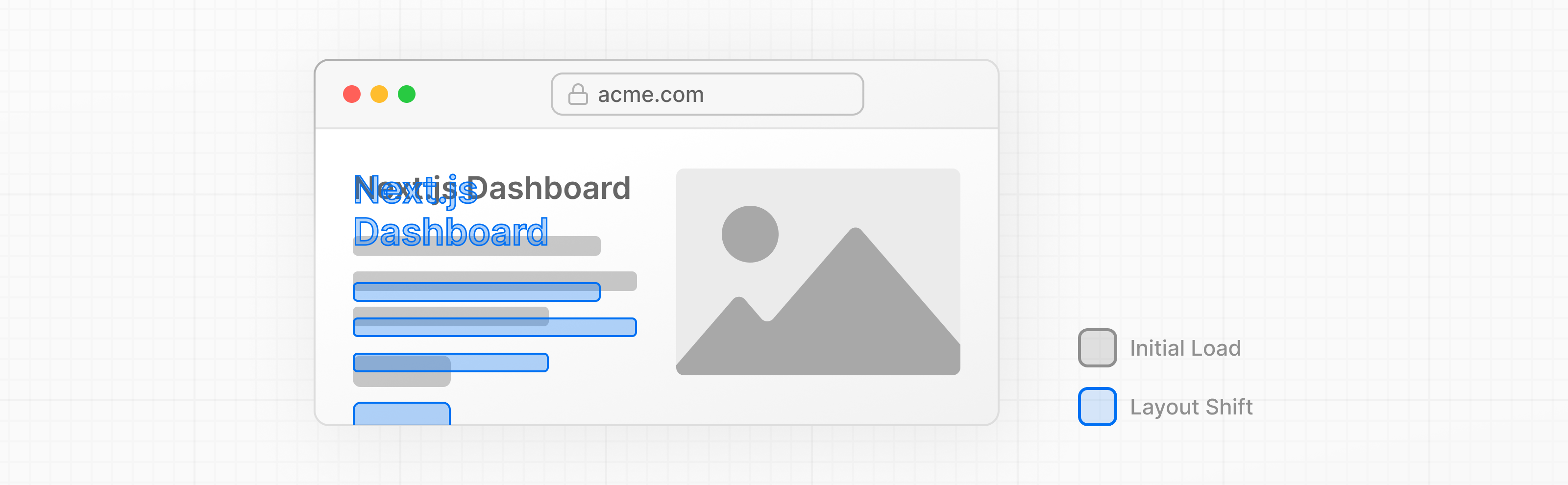
Next.js automatically optimizes fonts in the application when you use the next/font module. It downloads font files at build time and hosts them with your other static assets. This means when a user visits your application, there are no additional network requests for fonts which would impact performance.
Adding a primary font
Let's add a custom Google font to your application to see how this works!
In your /app/ui folder, create a new file called fonts.ts. You'll use this file to keep the fonts that will be used throughout your application.
Import the Inter font from the next/font/google module - this will be your primary font. Then, specify what subset you'd like to load. In this case, 'latin':
import { Inter } from 'next/font/google';

export const inter = Inter({ subsets: ['latin'] });
Finally, add the font to the <body> element in /app/layout.tsx:
import '@/app/ui/global.css';
import { inter } from '@/app/ui/fonts';

export default function RootLayout({
  children,
}: {
  children: React.ReactNode;
}) {
  return (
    <html lang="en">
      <body className={`${inter.className} antialiased`}>{children}</body>
    </html>
  );
}
By adding Inter to the <body> element, the font will be applied throughout your application. Here, you're also adding the Tailwind antialiased class which smooths out the font. It's not necessary to use this class, but it adds a nice touch.
Navigate to your browser, open dev tools and select the body element. You should see Inter and Inter_Fallback are now applied under styles.
Practice: Adding a secondary font
You can also add fonts to specific elements of your application.
Now it's your turn! In your fonts.ts file, import a secondary font called Lusitana and pass it to the <p> element in your /app/page.tsx file. In addition to specifying a subset like you did before, you'll also need to specify the font weight.
Once you're ready, expand the code snippet below to see the solution.
Hints:
- If you're unsure what weight options to pass to a font, check the TypeScript errors in your code editor.
- Visit the Google Fonts website and search for
Lusitanato see what options are available.- See the documentation for adding multiple fonts and the full list of options.
Finally, the <AcmeLogo /> component also uses Lusitana. It was commented out to prevent errors, you can now uncomment it:
// ...

export default function Page() {
  return (
    <main className="flex min-h-screen flex-col p-6">
      <div className="flex h-20 shrink-0 items-end rounded-lg bg-blue-500 p-4 md:h-52">
        <AcmeLogo />
        {/* ... */}
      </div>
    </main>
  );
}
Great, you've added two custom fonts to your application! Next, let's add a hero image to the home page.
Why optimize images?
Next.js can serve static assets, like images, under the top-level /public folder. Files inside /public can be referenced in your application.
With regular HTML, you would add an image as follows:
<img
  src="/hero.png"
  alt="Screenshots of the dashboard project showing desktop version"
/>
However, this means you have to manually:
- Ensure your image is responsive on different screen sizes.
- Specify image sizes for different devices.
- Prevent layout shift as the images load.
- Lazy load images that are outside the user's viewport.
Image Optimization is a large topic in web development that could be considered a specialization in itself. Instead of manually implementing these optimizations, you can use the next/image component to automatically optimize your images.
The <Image> component
The <Image> Component is an extension of the HTML <img> tag, and comes with automatic image optimization, such as:
- Preventing layout shift automatically when images are loading.
- Resizing images to avoid shipping large images to devices with a smaller viewport.
- Lazy loading images by default (images load as they enter the viewport).
- Serving images in modern formats, like WebP and AVIF, when the browser supports it.
Adding the desktop hero image
Let's use the <Image> component. If you look inside the /public folder, you'll see there are two images: hero-desktop.png and hero-mobile.png. These two images are completely different, and they'll be shown depending if the user's device is a desktop or mobile.
In your /app/page.tsx file, import the component from next/image. Then, add the image under the comment:
import AcmeLogo from '@/app/ui/acme-logo';
import { ArrowRightIcon } from '@heroicons/react/24/outline';
import Link from 'next/link';
import { lusitana } from '@/app/ui/fonts';
import Image from 'next/image';

export default function Page() {
  return (
    // ...
    <div className="flex items-center justify-center p-6 md:w-3/5 md:px-28 md:py-12">
      {/* Add Hero Images Here */}
      <Image
        src="/hero-desktop.png"
        width={1000}
        height={760}
        className="hidden md:block"
        alt="Screenshots of the dashboard project showing desktop version"
      />
    </div>
    //...
  );
}
Here, you're setting the width to 1000 and height to 760 pixels. It's good practice to set the width and height of your images to avoid layout shift, these should be an aspect ratio identical to the source image.
You'll also notice the class hidden to remove the image from the DOM on mobile screens, and md:block to show the image on desktop screens.
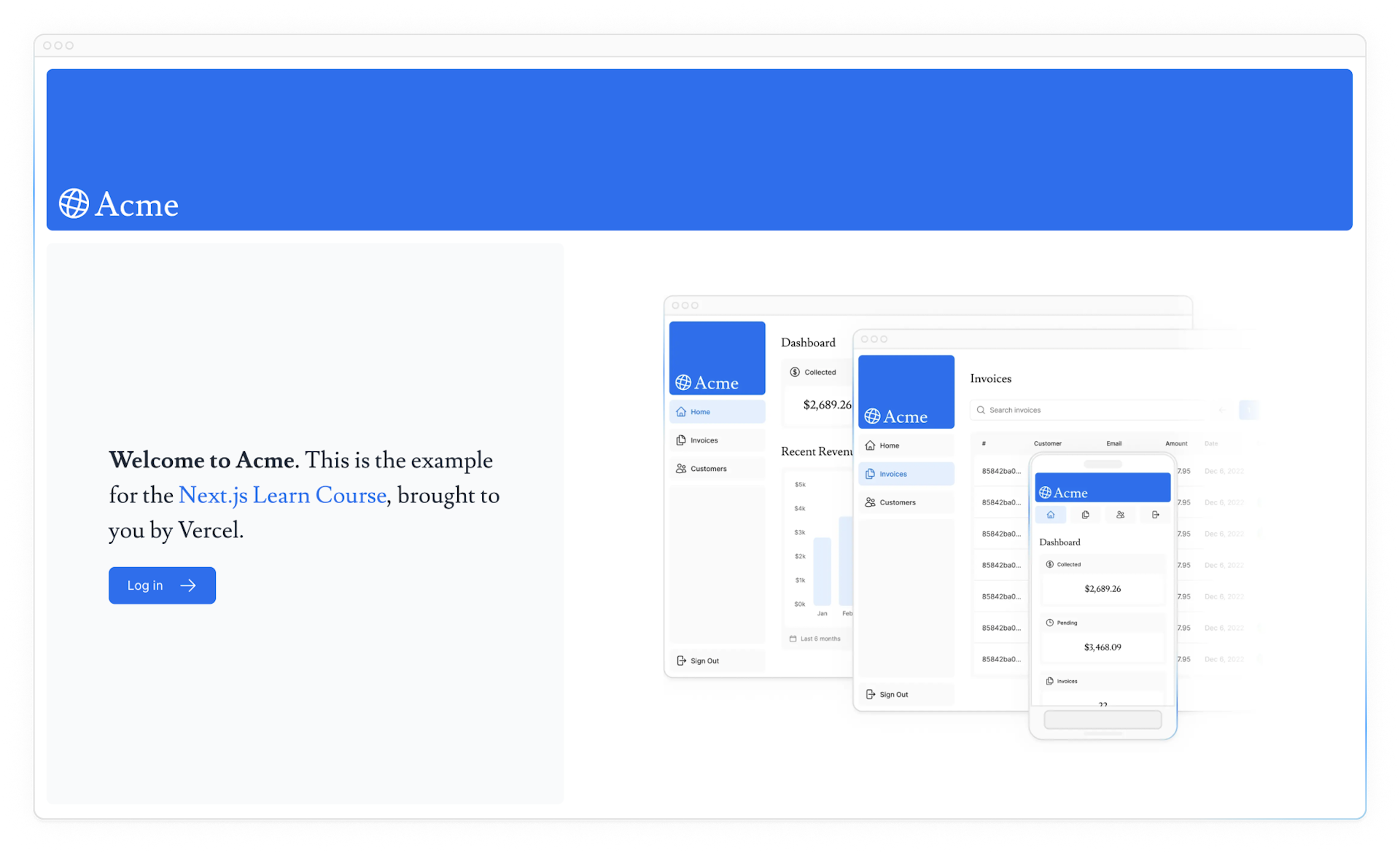
This is what your home page should look like now:

Practice: Adding the mobile hero image
Now it's your turn! Under the image you've just added, add another <Image> component for hero-mobile.png.
- The image should have a
widthof560andheightof620pixels. - It should be shown on mobile screens, and hidden on desktop - you can use dev tools to check if the desktop and mobile images are swapped correctly.
Once you're ready, expand the code snippet below to see the solution.
Great! Your home page now has a custom font and hero images.
Recommended reading
There's a lot more to learn about these topics, including optimizing remote images and using local font files. If you'd like to dive deeper into fonts and images, see:
You've Completed Chapter 3
You've learned how to optimize fonts and images using Next.js.
Was this helpful?