14
Chapter 14
Improving Accessibility
In the previous chapter, we looked at how to catch errors (including 404 errors) and display a fallback to the user. However, we still need to discuss another piece of the puzzle: form validation. Let's see how to implement server-side validation with Server Actions, and how you can show form errors using the useFormState hook - while keeping accessibility in mind!
In this chapter...
Here are the topics we’ll cover
How to use eslint-plugin-jsx-a11y with Next.js to implement accessibility best practices.
How to implement server-side form validation.
How to use the React useFormState hook to handle form errors, and display them to the user.
What is accessibility?
Accessibility refers to designing and implementing web applications that everyone can use, including those with disabilities. It's a vast topic that covers many areas, such as keyboard navigation, semantic HTML, images, colors, videos, etc.
While we won't go in-depth into accessibility in this course, we'll discuss the accessibility features available in Next.js and some common practices to make your applications more accessible.
If you'd like to learn more about accessibility, we recommend the Learn Accessibility course by web.dev.
Using the ESLint accessibility plugin in Next.js
By default, Next.js includes the eslint-plugin-jsx-a11y plugin to help catch accessibility issues early. For example, this plugin warns if you have images without alt text, use the aria-* and role attributes incorrectly, and more.
Let's see how this works!
Add next lint as a script in your package.json file:
"scripts": {
    "build": "next build",
    "dev": "next dev",
    "seed": "node -r dotenv/config ./scripts/seed.js",
    "start": "next start",
    "lint": "next lint"
},
Then run npm run lint in your terminal:
npm run lintYou should see the following warning:
✔ No ESLint warnings or errorsHowever, what would happen if you had an image without alt text? Let's find out!
Go to /app/ui/invoices/table.tsx and remove the alt prop from the image. You can use your editor's search feature to quickly find the <Image>:
<Image
  src={invoice.image_url}
  className="rounded-full"
  width={28}
  height={28}
  alt={`${invoice.name}'s profile picture`} // Delete this line
/>
Now run npm run lint again, and you should see the following warning:
./app/ui/invoices/table.tsx
45:25  Warning: Image elements must have an alt prop,
either with meaningful text, or an empty string for decorative images. jsx-a11y/alt-text
If you tried to deploy your application to Vercel, the warning would also show up in the build logs. This is because next lint runs as part of the build process. So you can run lint locally to catch accessibility issues before deploying your application.
Improving form accessibility
There are three things we're already doing to improve accessibility in our forms:
- Semantic HTML: Using semantic elements (
<input>,<option>, etc) instead of<div>. This allows assistive technologies (AT) to focus on the input elements and provide appropriate contextual information to the user, making the form easier to navigate and understand. - Labelling: Including
<label>and thehtmlForattribute ensures that each form field has a descriptive text label. This improves AT support by providing context and also enhances usability by allowing users to click on the label to focus on the corresponding input field. - Focus Outline: The fields are properly styled to show an outline when they are in focus. This is critical for accessibility as it visually indicates the active element on the page, helping both keyboard and screen reader users to understand where they are on the form. You can verify this by pressing
tab.
These practices lay a good foundation for making your forms more accessible to many users. However, they don't address form validation and errors.
Form validation
Go to http://localhost:3000/dashboard/invoices/create, and submit an empty form. What happens?
You get an error! This is because you're sending empty form values to your Server Action. You can prevent this by validating your form on the client or the server.
Client-Side validation
There are a couple of ways you can validate forms on the client. The simplest would be to rely on the form validation provided by the browser by adding the required attribute to the <input> and <select> elements in your forms. For example:
<input
  id="amount"
  name="amount"
  type="number"
  placeholder="Enter USD amount"
  className="peer block w-full rounded-md border border-gray-200 py-2 pl-10 text-sm outline-2 placeholder:text-gray-500"
  required
/>
Submit the form again, and you should now see the browser a warning if you try to submit a form with empty values.
This approach is generally okay because some ATs support browser validation.
An alternative to client-side validation is server-side validation. Let's see how you can implement it in the next section. For now, delete the required attributes if you added them.
Server-Side validation
By validating forms on the server, you can:
- Ensure your data is in the expected format before sending it to your database.
- Reduce the risk of malicious users bypassing client-side validation.
- Have one source of truth for what is considered valid data.
In your create-form.tsx component, import the useFormState hook from react-dom. Since useFormState is a hook, you will need to turn your form into a Client Component using "use client" directive:
'use client';

// ...
import { useFormState } from 'react-dom';
Inside your Form Component, the useFormState hook:
- Takes two arguments:
(action, initialState). - Returns two values:
[state, dispatch]- the form state, and a dispatch function (similar to useReducer)
Pass your createInvoice action as an argument of useFormState, and inside your <form action={}> attribute, call dispatch.
// ...
import { useFormState } from 'react-dom';

export default function Form({ customers }: { customers: CustomerField[] }) {
  const [state, dispatch] = useFormState(createInvoice, initialState);

  return <form action={dispatch}>...</form>;
}
The initialState can be anything you define, in this case, create an object with two empty keys: message and errors.
// ...
import { useFormState } from 'react-dom';

export default function Form({ customers }: { customers: CustomerField[] }) {
  const initialState = { message: null, errors: {} };
  const [state, dispatch] = useFormState(createInvoice, initialState);

  return <form action={dispatch}>...</form>;
}
This may seem confusing initially, but it'll make more sense once you update the server action. Let's do that now.
In your action.ts file, you can use Zod to validate form data. Update your FormSchema as follows:
const FormSchema = z.object({
  id: z.string(),
  customerId: z.string({
    invalid_type_error: 'Please select a customer.',
  }),
  amount: z.coerce
    .number()
    .gt(0, { message: 'Please enter an amount greater than $0.' }),
  status: z.enum(['pending', 'paid'], {
    invalid_type_error: 'Please select an invoice status.',
  }),
  date: z.string(),
});customerId- Zod already throws an error if the customer field is empty as it expects a typestring. But let's add a friendly message if the user doesn't select a customer.amount- Since you are coercing the amount type fromstringtonumber, it'll default to zero if the string is empty. Let's tell Zod we always want the amount greater than 0 with the.gt()function.status- Zod already throws an error if the status field is empty as it expects "pending" or "paid". Let's also add a friendly message if the user doesn't select a status.
Next, update your createInvoice action to accept two parameters:
// This is temporary until @types/react-dom is updated
export type State = {
  errors?: {
    customerId?: string[];
    amount?: string[];
    status?: string[];
  };
  message?: string | null;
};

export async function createInvoice(prevState: State, formData: FormData) {
  // ...
}formData- same as before.prevState- contains the state passed from theuseFormStatehook. You won't be using it in the action in this example, but it's a required prop.
Then, change the Zod parse() function to safeParse():
export async function createInvoice(prevState: State, formData: FormData) {
  // Validate form fields using Zod
  const validatedFields = CreateInvoice.safeParse({
    customerId: formData.get('customerId'),
    amount: formData.get('amount'),
    status: formData.get('status'),
  });

  // ...
}
safeParse() will return an object containing either a success or error field. This will help handle validation more gracefully without having put this logic inside the try/catch block.
Before sending the information to your database, check if the form fields were validated correctly with a conditional:
export async function createInvoice(prevState: State, formData: FormData) {
  // Validate form fields using Zod
  const validatedFields = CreateInvoice.safeParse({
    customerId: formData.get('customerId'),
    amount: formData.get('amount'),
    status: formData.get('status'),
  });

  // If form validation fails, return errors early. Otherwise, continue.
  if (!validatedFields.success) {
    return {
      errors: validatedFields.error.flatten().fieldErrors,
      message: 'Missing Fields. Failed to Create Invoice.',
    };
  }

  // ...
}
If validatedFields isn't successful, we return the function early with the error messages from Zod.
Tip: console.log
validatedFieldsand submit an empty form to see the shape of it.
Finally, since you're handling form validation separately, outside your try/catch block, you can return a specific message for any database errors, your final code should look like this:
export async function createInvoice(prevState: State, formData: FormData) {
  // Validate form using Zod
  const validatedFields = CreateInvoice.safeParse({
    customerId: formData.get('customerId'),
    amount: formData.get('amount'),
    status: formData.get('status'),
  });

  // If form validation fails, return errors early. Otherwise, continue.
  if (!validatedFields.success) {
    return {
      errors: validatedFields.error.flatten().fieldErrors,
      message: 'Missing Fields. Failed to Create Invoice.',
    };
  }

  // Prepare data for insertion into the database
  const { customerId, amount, status } = validatedFields.data;
  const amountInCents = amount * 100;
  const date = new Date().toISOString().split('T')[0];

  // Insert data into the database
  try {
    await sql`
      INSERT INTO invoices (customer_id, amount, status, date)
      VALUES (${customerId}, ${amountInCents}, ${status}, ${date})
    `;
  } catch (error) {
    // If a database error occurs, return a more specific error.
    return {
      message: 'Database Error: Failed to Create Invoice.',
    };
  }

  // Revalidate the cache for the invoices page and redirect the user.
  revalidatePath('/dashboard/invoices');
  redirect('/dashboard/invoices');
}
Great, now let's display the errors in your form component. Back in the create-form.tsx component, you can access the errors using the form state.
Add a ternary operator that checks for each specific error. For example, after the customer's field, you can add:
<form action={dispatch}>
  <div className="rounded-md bg-gray-50 p-4 md:p-6">
    {/* Customer Name */}
    <div className="mb-4">
      <label htmlFor="customer" className="mb-2 block text-sm font-medium">
        Choose customer
      </label>
      <div className="relative">
        <select
          id="customer"
          name="customerId"
          className="peer block w-full rounded-md border border-gray-200 py-2 pl-10 text-sm outline-2 placeholder:text-gray-500"
          defaultValue=""
          aria-describedby="customer-error"
        >
          <option value="" disabled>
            Select a customer
          </option>
          {customers.map((name) => (
            <option key={name.id} value={name.id}>
              {name.name}
            </option>
          ))}
        </select>
        <UserCircleIcon className="pointer-events-none absolute left-3 top-1/2 h-[18px] w-[18px] -translate-y-1/2 text-gray-500" />
      </div>
      <div id="customer-error" aria-live="polite" aria-atomic="true">
        {state.errors?.customerId &&
          state.errors.customerId.map((error: string) => (
            <p className="mt-2 text-sm text-red-500" key={error}>
              {error}
            </p>
          ))}
      </div>
    </div>
    // ...
  </div>
</form>
Tip: You can console.log
stateinside your component and check if everything is wired correctly. Check the console in Dev Tools as your form is now a Client Component.
In the code above, you're also adding the following aria labels:
aria-describedby="customer-error": This establishes a relationship between theselectelement and the error message container. It indicates that the container withid="customer-error"describes theselectelement. Screen readers will read this description when the user interacts with theselectbox to notify them of errors.id="customer-error": Thisidattribute uniquely identifies the HTML element that holds the error message for theselectinput. This is necessary foraria-describedbyto establish the relationship.aria-live="polite": The screen reader should politely notify the user when the error inside thedivis updated. When the content changes (e.g. when a user corrects an error), the screen reader will announce these changes, but only when the user is idle so as not to interrupt them.
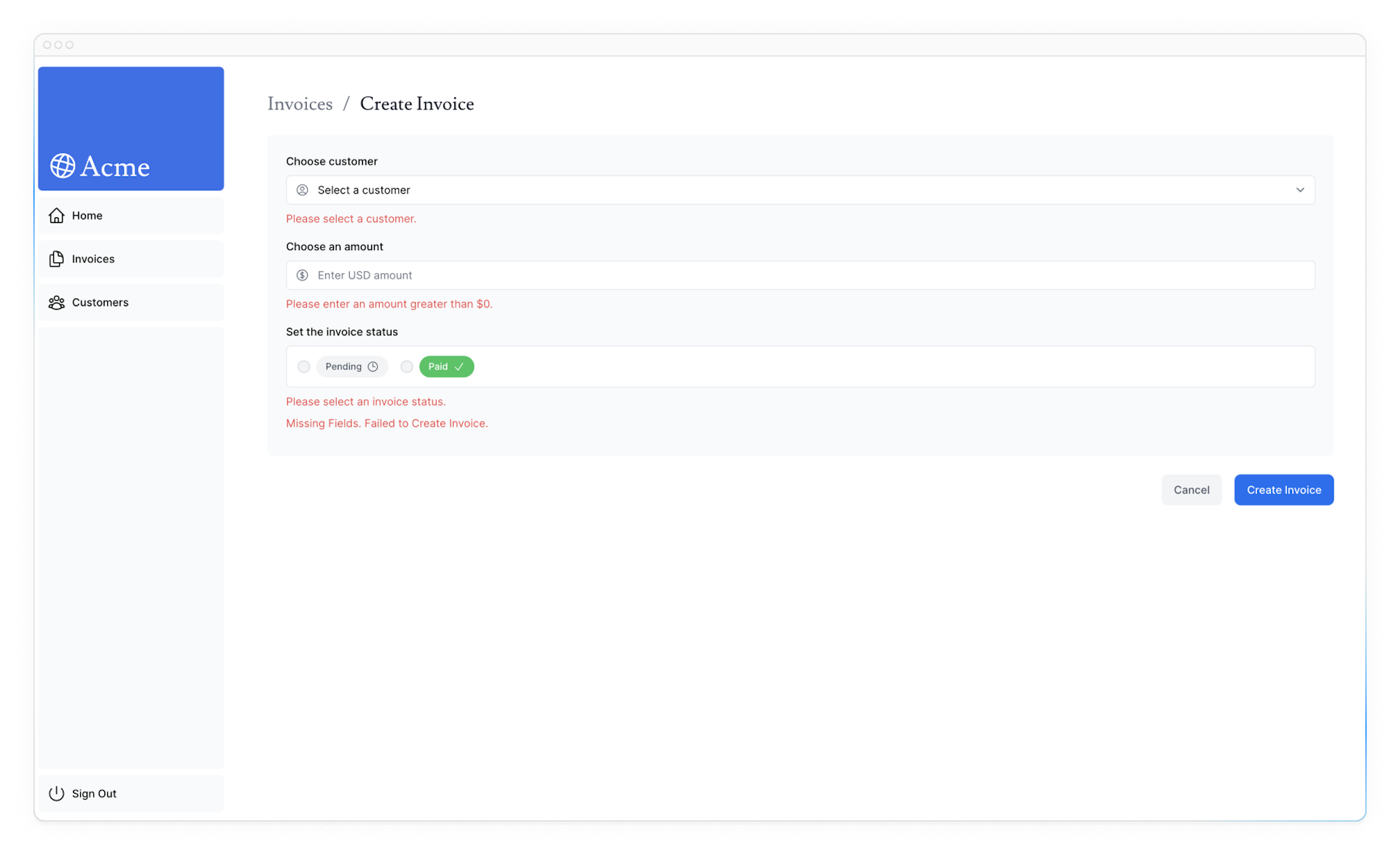
Practice: Adding aria labels
Using the example above, add errors to your remaining form fields. You should also show a message at the bottom of the form if any fields are missing. Your UI should look like this:

Once you're ready, run npm run lint to check if you're using the aria labels correctly.
If you'd like to challenge yourself, take the knowledge you've learned in this chapter and add form validation to the edit-form.tsx component.
You'll need to:
- Add
useFormStateto youredit-form.tsxcomponent. - Edit the
updateInvoiceaction to handle validation errors from Zod. - Display the errors in your component, and add aria labels to improve accessibility.
Once you're ready, expand the code snippet below to see the solution:
You've Completed Chapter 14
Great, you've learned how to improve accessibility in your forms with React Form Status and Server-side Validation.
Was this helpful?